Building a Fresh, Local-First Beverage Brand
Joose Woose is a modern sugarcane juice brand inspired by India’s street-side freshness and reimagined for today’s hygienic, design-conscious consumer. The brand set out to transform a familiar local beverage into a scalable, premium quick-service concept.
Creative Brothers partnered with Joose Woose to craft a bold visual identity and an immersive on-ground brand experience that feels energetic, youthful, and unmistakably Indian.
The Challenge
Sugarcane juice is deeply rooted in local culture, but most existing setups lack:
- Brand recall
- Visual consistency
- A premium yet approachable look
- Scalable design for multiple outlets
The challenge was to elevate a roadside classic into a contemporary brand without losing its authenticity.
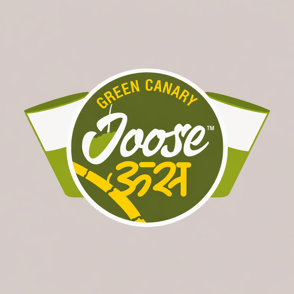
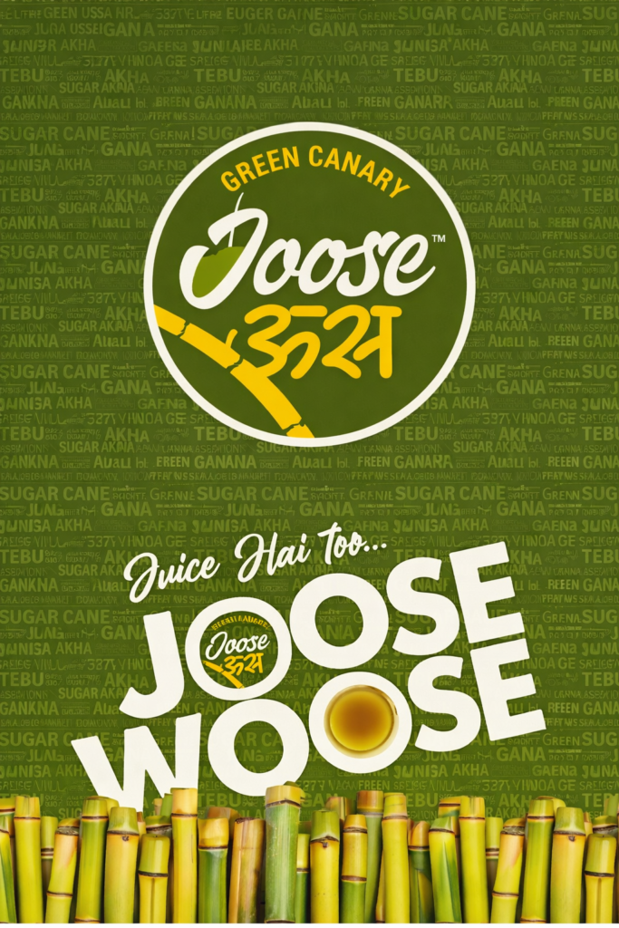
Brand Identity & Logo Design
- Chose a green–yellow palette to instantly communicate freshness, energy, and natural ingredients
- Developed a playful yet confident logo inspired by sugarcane, freshness, and local typography
- Created a bilingual-friendly visual language suitable for Indian streets and modern retail spaces
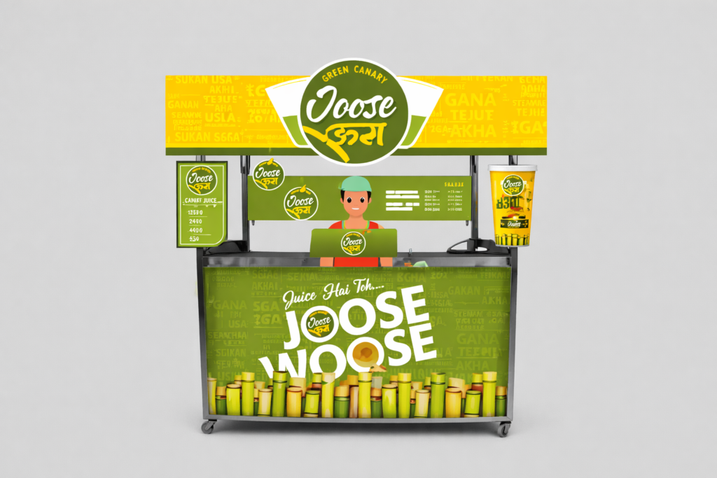
Kiosk & Cart Design
- Designed a high-visibility juice cart with bold typography and layered graphics
- Ensured clear product communication, pricing visibility, and menu readability
- Balanced aesthetics with functionality for daily operations
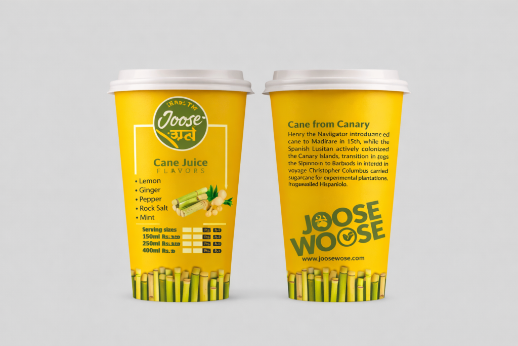
Packaging Design
- Designed takeaway cups that extend the brand story
- Used strong color blocks, ingredient highlights, and brand messaging
- Ensured the cups look premium, photogenic, and social-media ready
Visual Storytelling
- Integrated sugarcane imagery and patterns to reinforce the product’s core
- Used repetition and rhythm in graphics to create instant brand recall
- Designed the entire system to be scalable across multiple outlets
The Result
- A distinctive, street-smart brand that instantly grabs attention
- Strong shelf and street presence with high recall value
- A cohesive brand system that works across kiosks, cups, and future extensions
- A design language that feels local, fresh, and modern